
As an Amazon Associate, I earn from qualifying purchases.
There’s a specific kind of sadness to a blank wall. Not dramatic sadness — just that low hum of this room is technically finished and I feel nothing. You’ve got the couch. You’ve got the plant you’re 60% sure is dying. And then there’s four feet of beige nothing above the sofa, quietly announcing to every guest that you moved in eighteen months ago and never emotionally arrived. Wall decor is the fastest, cheapest lie you can tell about how together your life is. None of it is useful. All of it works. Let’s go.
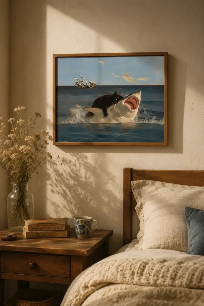
The Cat Who Is Simply Hugging a Shark, No Notes
This is the piece that makes people stop mid-sentence and go “wait, what is happening in that picture.” Which is, frankly, the whole point — it’s an icebreaker disguised as art. It’s funny without being a meme, which is a narrower tightrope than it sounds.
I will say: this reads young. If your aesthetic is quiet-luxury-beige, this will fight you. But if your apartment already has a Squishmallow situation, it’ll fit right in.
Best for: Home offices, dorm rooms, and anyone whose Zoom background needs a conversation piece.
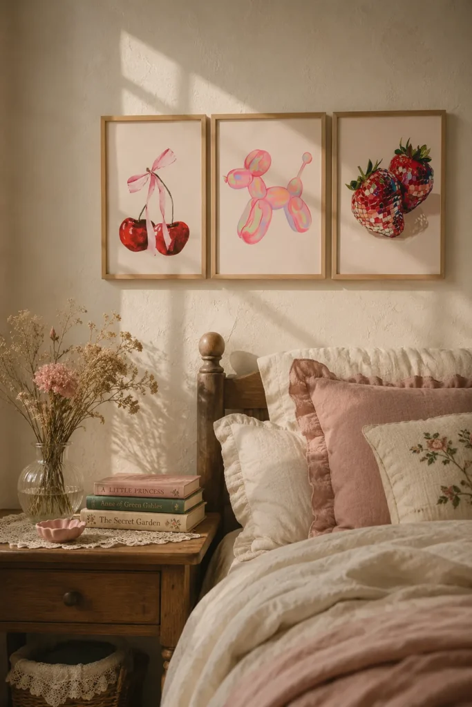
The Red Triptych That Does All the Work for You
Cherries, a balloon dog, a strawberry. Three panels, one very loud color story, zero thinking required from you. This is the closest thing to a cheat code on this list — triptychs solve the “I have a wide wall and no ideas” problem instantly because the spacing does the composition for you.
That red is committed, though. It will pull every other color in the room toward it whether you asked it to or not. If your space is already warm-toned, gorgeous. If you’ve got a lot of cool grays, this will look like it wandered in from a different apartment.
Best for: Above a sofa, a dining nook, or a kitchen wall that needs one bold idea instead of five small ones.
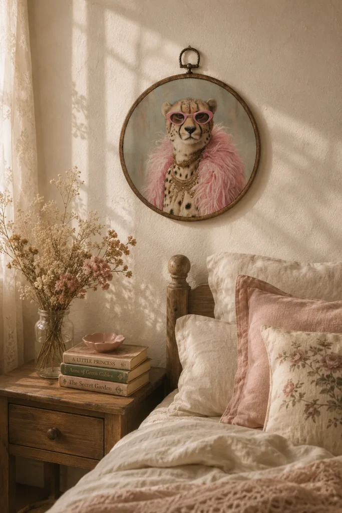
The Leopard in Pink Sunglasses Who Is Doing Better Than Both of Us
Fashion-illustration energy — the kind of thing you’d expect in a boutique dressing room, which is either a compliment or a warning depending on your tolerance for whimsy. It’s confident. It’s a little smug. I respect it.
Honestly this is the most “Pinterest board made flesh” item here, and I mean that with love, because I own things exactly like it and have never once regretted it.
Best for: Closets, vanity corners, and anywhere you get dressed and need encouragement.
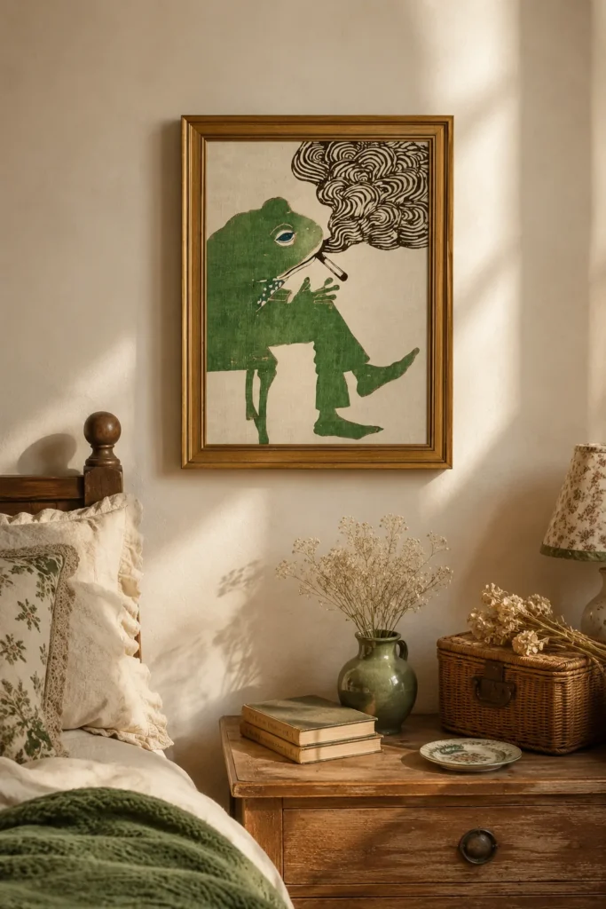
The Frog With a Cigarette Who Has Seen Some Things
Pure deadpan. It’s a frog. It’s smoking. That’s the joke, and the joke lands because it’s delivered with total sincerity. This is bathroom art, and I say that as the highest possible praise — bathroom walls are where your weirdest taste gets to live rent-free.
Not for everyone. If you host your boss for dinner, maybe not the entryway. But in the right small room it’s perfect.
Best for: Guest bathrooms, bar carts, and people whose humor runs dry.
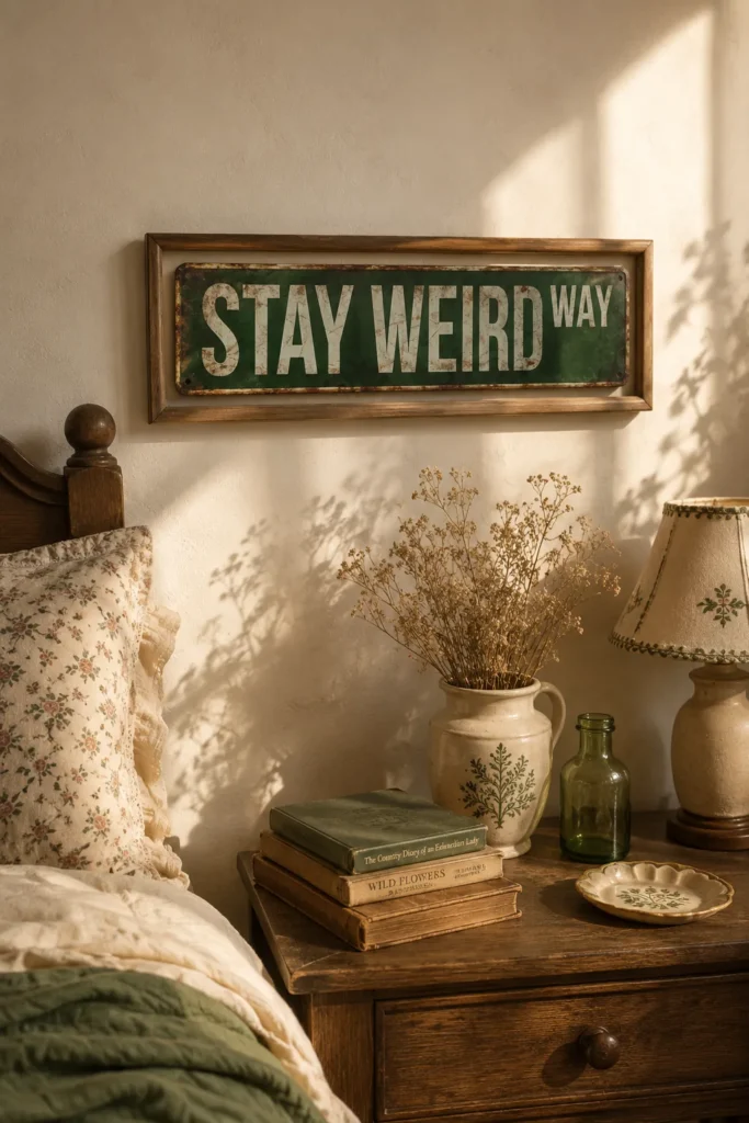
The “Stay Weird” Sign That Says the Quiet Part Loudly
Metal road-sign format, which is what saves it — the industrial material keeps the sentiment from tipping into Live Laugh Love territory. Barely. It’s walking a line.
I’ll be honest: text-based decor is the riskiest category on this list because words date faster than images. But metal signage has texture and weight that a canvas quote doesn’t, and that’s the difference between “cool” and “clearance aisle.”
Best for: Garages, craft rooms, gallery walls that need a hard edge.
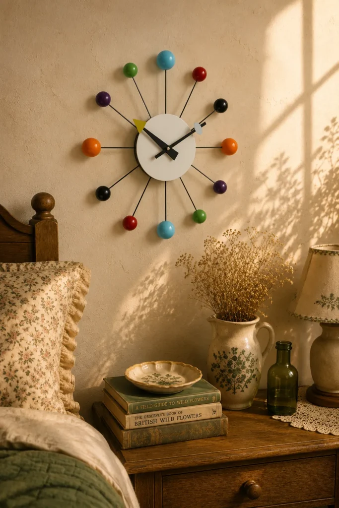
The Confetti Ball Clock (Technically Useful, Sorry)
Okay, this one betrays the brand philosophy slightly, because it tells time. But the little colored balls make it read as sculpture first and clock second, and I think that counts as a loophole. It brings a mid-century, playful, slightly Jetsons feeling to a wall.
The catch with any decorative clock: check the mechanism. Cute is nothing if it ticks loud enough to keep you awake.
Best for: Kitchens, playrooms, and anywhere a plain wall clock would be a waste.
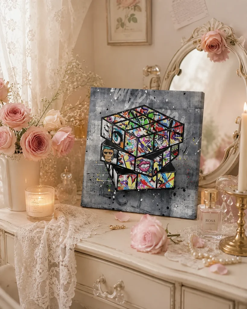
The Graffiti Rubik’s Cube That Belongs in a Sneaker Store
Street-art energy, bold color, zero subtlety. It gives a room that “I have taste but I’m not precious about it” feeling, which is a very hard vibe to buy and this gets surprisingly close.
Works best when it’s the only loud thing on the wall. Put it next to three other bright pieces and the whole wall starts yelling.
Best for: Teen rooms, home gyms, entryways with modern furniture.
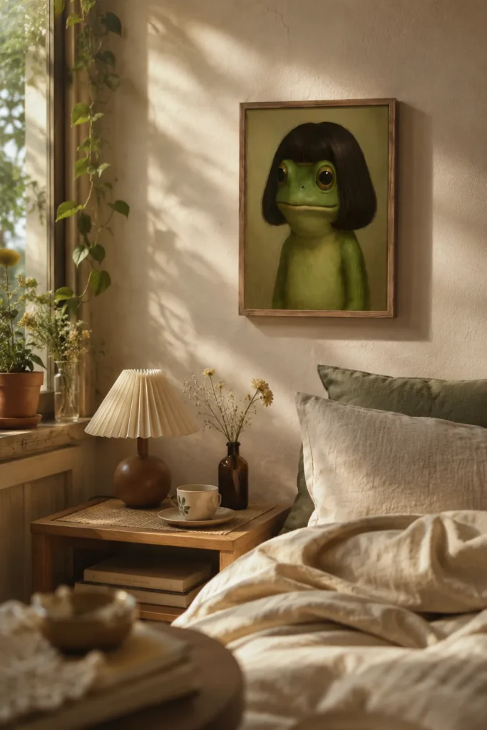
The Frog With a Bob Haircut (She’s Fine, She’s Great, She’s Thriving)
The second frog. I didn’t plan this. Apparently 2026 is a frog year and I’ve made peace with it. This one’s softer and more illustrative than the smoking one — cute rather than deadpan, with a haircut that suggests she has strong opinions about pottery.
Pairs beautifully with the other frog, actually. Two frogs, one wall, unhinged in a curated way.
Best for: Reading corners, bedrooms, anyone building a small weird gallery wall.
How to Hang This Stuff Without It Looking Like a Yard Sale
The single rule that saves every gallery wall: pick one thing that repeats. One color, one frame finish, one mood. If every piece is loud and unrelated, your wall looks like a bulletin board. If the frames all match, you can hang genuinely unhinged art and it still reads as intentional.
Second: hang lower than you think. Center of the piece should sit at eye level — roughly 57 to 60 inches from the floor. Most people hang art way too high, and it makes a room feel like a hallway in a dentist’s office.
Third: leave breathing room. Two to three inches between frames in a cluster, and don’t fill every inch of the wall. Negative space is what tells people you chose this instead of accumulated it.
Before You Click Anything
Wall art is one of the easiest categories to get burned in, because photos lie. So: check the size in the listing against an actual tape measure on your actual wall — “large canvas” means nothing. Read the recent reviews, not the ones from two years ago, because sellers swap manufacturers constantly. And scroll to the customer photos. That’s where you find out the print is dimmer, the red is orange, or the frame is a sticker pretending to be a frame.
None of this will improve your life in any measurable way. That’s kind of the point.